| Узбекистан, Бухара, Бухарский институт высоких технологий, 2013 |
The tools of the trade
The KDE desktop
KDE is a complicated system, and good documentation is available at http://www.kde.0rg/documentation/. Once you have KDE running, you can access the same information via the help icon on the panel at the bottom (the life ring icon). The following description gives a brief introduction.
The KDE display contains a number of distinct areas. At the top is an optional menu, at the bottom an almost optional panel, and the middle of the screen is reserved for windows.
The Desktop Menu
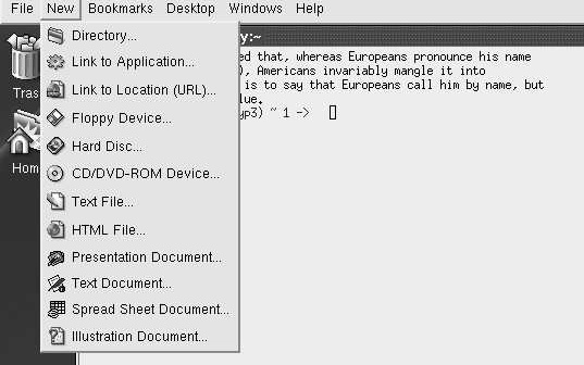
The Desktop Menu is at the very top of the screen. It provides functionality that is not specific to a particular application. Select the individual categories with the mouse. For example, the New menu looks like this:
As the menu indicates, you can use these menus to create new files.
The Panel
At the bottom of the screen is the panel, which consists of a number of fields. The left-hand section is used for starting applications.
The stylized letter K at the extreme left is the Application Starter. When you select it, a long vertical menu appears at the left of the screen and allows you to start programs ("applications") or access just about any other function.
Next comes an icon called "showdesktop." This is a convenient way to iconify all the windows currently on the desktop.
The remaining icons on this part of the panel represent various applications.
- The konsole terminal emulator.
- The command center, which you use to configure KDE.
- The help system.
- Access to the home directory with the browser konqueror.
- Access to the Web, also with the browser konqueror.
- The Kmail MUA.
- The KWord word processor, which can understand Microsoft Word documents.
- The Kspread spreadsheet.
- The Kpresenter presentation package.
- The Kate editor.
The next section of the panel contains some control buttons and information about the current desktop layout:
The section at the left shows the current contents of four screens, numbered 1 to 4. Screen 1 is the currently displayed screen; you can select one of the others by moving the cursor in the corresponding direction, or by selecting the field with the mouse.
To the right of that are icons for the currently active windows. The size expands and contracts depending on the number of different kinds of window active. If you select one of these icons with the left mouse button, it will iconify or deiconify ("minimize" or "maximize") the window. If you have multiple xterms active, you will only have one icon. In this case, if you select the icon, you will get another pop-up selection menu to allow you to choose the specific window.
The right part of the panel contains a further three fields:
- The first one shows a stylized padlock (for locking the session when you leave the machine; unlock by entering your password) and a stylized off switch, for logging out of the session.
- The next section shows a stylized power connector, which displays the current power status of the machine, and a clipboard.
- The right side shows a digital clock.
Probably the most useful part of this section of the panel is not very obvious: the right-pointing arrow allows you to remove the panel if you find it's in the way. The entire panel is replaced by a single left-pointing arrow at the extreme right of the display.
Using the mouse
By default, kde only uses the left and the right mouse buttons. In general, the left button is used to select a particular button, and the right button is used for an auxiliary menu.
Manipulating windows
You'll notice that each window has a frame around it with a number of features. In X terminology, they're called decorations. Specifically:
- There's a title bar with the name of the program. If you select the bar itself, you raise the window above all others. If you hold down the button on the title bar, you can move the window.
- At the left of the title bar there is an X logo. If you select this logo, you get a menu of window operations.
- At the right of the title bar, there are three buttons that you can select. The left one iconifies the window, the middle one maximizes the window, making it take up the entire screen, and the one on the right kills the application. If the window is already maximized, the middle button restores it to its previous size.
- You can select any corner of the window, or any of the other edges, to change the size of the window.
The fvwm2 window manager
If you come from a conventional PC background, you shouldn't have much difficulty with KDE. It's a relatively complete, integrated environment. But it isn't really UNIX. If you come from a UNIX environment, you may find it too all-encompassing. You may also find that there are significant delays when you start new applications.
UNIX has a very different approach to windows. There is no desktop; just a window manager. It takes up less disk space, less processor time, and less screen real estate. By default, XFree86 comes with the twm window manager, but that's really a little primitive. With modern machines, there's no reason to choose such a basic window manager. You may, however, find that fvwm2 is more your style than KDE.
Starting fvwm2
Like KDE, you install fvwm2 from the Ports Collection. It's not designed to work completely correctly out of the box, though it does work. As with KDE, the first thing you need to do is to create a .xsession or .xinitrc file, depending on whether you're running xdm. It must contain at least the line:
fvwm2
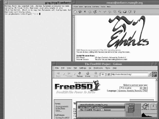
Start X the same way you did for KDE. This time you see, after starting the same applications as before:
This picture shows both similarities with and differences from KDE. The similarities include:
- Each window has a frame and a title. The exact form of the decorations is different, but the purpose is the same. There is no "close application" button: for most UNIX applications, you should get the program to exit rather than killing it.
- There is a task bar at the bottom right, taking up only half the width of the screen. The currently active window (the xterm at the left in this example) is highlighted.
- The default fvwm2 display also has four screens, and the task bar shows the position of the windows on the task bar.
Still, there are a number of differences as well:
- Unless you have a top-end machine, it's much faster in what it does.
- The background (the root window) doesn't have any pattern; it's just a grey cross-hatch.
- You can move from one screen to the other using the cursor, and windows can overlap. In this example, the galeon web browser window goes down to the screen below, and the Emacs window goes overall four screens, as the display on the task bar shows. With KDE, the only way to display the rest of these windows is to move the window.
- Paradoxically, you can do a lot more with the mouse. On the root window, the left mouse button gives you a menu for starting various programs, both locally and remotely, and also various window utilities. The middle button gives you direct access to the window manipulation utilities, and the right button gives a drop-down list to select any of the currently active windows:
The menus above show one of the problems: look at those system names on the left submenu (dopey, snoopy and friends). They don't exist on our sample network and the chance of them existing on your network is pretty low as well. They're hard-coded in the sample configuration file, /usr/X11R6/etc/system.fvwm2rc. To use fvwm2 effectively; you'll have to modify the configuration file. The best thing to do is to make a copy of /usr/X11R6/etc/system.fvwm2rc in your own directory, as ~/.fVwm2/.fvwm2rc. Then you can have lots of fun tweaking the file to do exactly what you want it to do. Clearly, KDE is easier to set up.


